
Codecademy front-end engineer course
DAY14
- Learn CSS: Learn Color for UI
- Contrast Constraints [대비를 적절히 사용하자.]
: Contrast is a great way to differentiate elements on a page. However, When thinking about and applying contrast to a page through the use of color, it’s important to limit the overall amount of contrast.
-Brand Color [브랜드 컬러를 참조하자.]
: This brand color will account for roughly 60% of the color used on your site, and helps build a bridge between your product and the user’s recognition of it
https://brandcolors.net/ (브랜드 색조합 사이트)
BrandColors - official brand color hex codes
Close Modal About BrandColors BrandColors was created by DesignBombs. The goal was to create a helpful reference for the brand color codes that are needed most often. It's been featured by Smashing Magazine, CSS-Tricks, Web Design Depot, Tuts+, and over 2
brandcolors.net
- Accent Color [메인 컬러를 정하자.]
:These supplementary hues provide small pops of color within your designs and can be used to draw the user’s attention
-Buttons [버튼]
.button:hover {
  opacity: 0.75;
}

.button-primary {
  background-color: #00CF63;
}

.button-secondary {
  background-color: #FFAA00;
}| hover state | - features a shade or tint of the accent color used for the buttons (something is happening as they scroll over top of an action) |
| disabled state | - the button cannot be clicked, either because it’s not an active button or the user must complete steps prior to the button activating |
-Forms [형태; 사용자의 행동상태]
: Form inputs are another type of component that use color to indicate an action to a user.
| default state | the user views the inputs when they first arrive at a page |
| second state (the selected, or active, state) | the user with a visual cue that they have highlighted the field and have the ability to type within it (it can be achieved by a border color or a box shadow effect) |
| disabled state | If the input field is unable to be edited or typed within |
-Semantic colors [의미를 가진 색을 사용하기]
*Semantic colors -> Inputs also have other colors that indicate success and failure.
| Red | - users should be alerted to understand where they went wrong. - Red is also used to provide more emphasis for delete buttons. |
| Green | - through the use of green as a success message - Green is also often used for actions that entice the user to submit, move forward, or go. |
| Yellow | - If an error occurs on the website and we need to notify the user, we should consider selecting a color that indicates the issue-level and one that does not conflict with our action colors. |
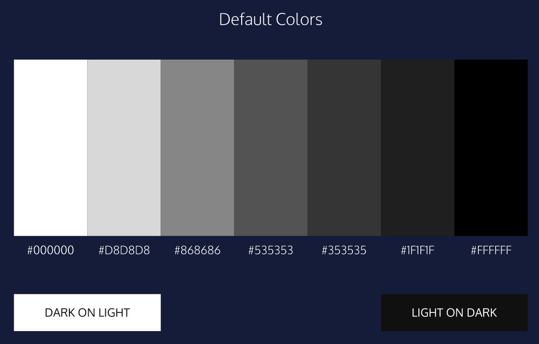
- Default Color [기본 색 - 그레이색상을 사용하자.]
:These default colors are used often as the color for text within your designs, as they provide plenty of contrast for reading and can fit into many other different color schemes
- Pure black on white can be hard on the user’s eyes because of the stark contrast.
- Use a darker gray for text on a white background
- Neutral Colors [중간 색 사용하기]
: Neutral colors, or hues with low lightness and/or saturation, make for good base colors as it allows you to add flourishes to the parts of the site
-> It allows you to add high contrast complementary components which help direct users visiting the site.
- White Space [공백 사용]
: Whitespace, or negative space, refers to the emptiness between elements.
-> By including too much spacing in-between elements, it can cause issues for users trying to navigate seamlessly through the content
* One way to add some nice space between elements on a page is by applying the property of padding to elements.
- Accessibility [웹 접근성 - 색맹]
many users can experience different types of color blindness:
| red-green | where users have a difficult time differentiating between the red and green colors. |
| blue-yellow | where the blues tend to appear greener |
| monochromatic | when users can’t see color at all. |
* which creates accessible color palettes for your site or app based on Web Content Accessibility Guidelines (WCAG).
Color Safe - accessible web color combinations
Pick a color to set the text color Click on a color square to preview text color in the upper toolbar. Click on the Hex or RGB value in the toolbar to copy to your clipboard. Got it
colorsafe.co
*to test how your selected colors work with web usability.
webaim.org/resources/contrastchecker/
WebAIM: Contrast Checker
Contrast Checker You are here: Home > Resources > Contrast Checker This tool requires Javascript. Normal Text The five boxing wizards jump quickly. Large Text The five boxing wizards jump quickly. Graphical Objects and User Interface Components image/svg+x
webaim.org
- Iterations [순환 고리]
: If usability and aesthetics conflict, it’s always best to err on the side of usability.
Test early and test often is the motto of designers!
* Keep users in mind when selecting color
*그 외 색상 참고 사이트
https://cloudflare.design/color
Color by Cloudflare Design
A color palette tool for interface design
cloudflare.design
'Web' 카테고리의 다른 글
| [CSS] 16)링크와 버튼 (#title, #hover state) (0) | 2021.02.04 |
|---|---|
| [Front-end] 15)웹페이지 텍스트 디자인 꿀팁 (0) | 2021.02.01 |
| [Front-end] 13)CSS 색이론으로 보는 꿀팁 (0) | 2021.01.28 |
| [CSS] 12) 디스플레이, 위치 (#inline, #inline-block, #clear) (0) | 2021.01.28 |
| [CSS] 11)박스 모델 변경 (#content-box #border-box) (0) | 2021.01.26 |
Codecademy front-end engineer course
DAY14
- Learn CSS: Learn Color for UI
- Contrast Constraints [대비를 적절히 사용하자.]
: Contrast is a great way to differentiate elements on a page. However, When thinking about and applying contrast to a page through the use of color, it’s important to limit the overall amount of contrast.
-Brand Color [브랜드 컬러를 참조하자.]
: This brand color will account for roughly 60% of the color used on your site, and helps build a bridge between your product and the user’s recognition of it
https://brandcolors.net/ (브랜드 색조합 사이트)
BrandColors - official brand color hex codes
Close Modal About BrandColors BrandColors was created by DesignBombs. The goal was to create a helpful reference for the brand color codes that are needed most often. It's been featured by Smashing Magazine, CSS-Tricks, Web Design Depot, Tuts+, and over 2
brandcolors.net
- Accent Color [메인 컬러를 정하자.]
:These supplementary hues provide small pops of color within your designs and can be used to draw the user’s attention
-Buttons [버튼]
.button:hover {
  opacity: 0.75;
}

.button-primary {
  background-color: #00CF63;
}

.button-secondary {
  background-color: #FFAA00;
}| hover state | - features a shade or tint of the accent color used for the buttons (something is happening as they scroll over top of an action) |
| disabled state | - the button cannot be clicked, either because it’s not an active button or the user must complete steps prior to the button activating |
-Forms [형태; 사용자의 행동상태]
: Form inputs are another type of component that use color to indicate an action to a user.
| default state | the user views the inputs when they first arrive at a page |
| second state (the selected, or active, state) | the user with a visual cue that they have highlighted the field and have the ability to type within it (it can be achieved by a border color or a box shadow effect) |
| disabled state | If the input field is unable to be edited or typed within |
-Semantic colors [의미를 가진 색을 사용하기]
*Semantic colors -> Inputs also have other colors that indicate success and failure.
| Red | - users should be alerted to understand where they went wrong. - Red is also used to provide more emphasis for delete buttons. |
| Green | - through the use of green as a success message - Green is also often used for actions that entice the user to submit, move forward, or go. |
| Yellow | - If an error occurs on the website and we need to notify the user, we should consider selecting a color that indicates the issue-level and one that does not conflict with our action colors. |
- Default Color [기본 색 - 그레이색상을 사용하자.]
:These default colors are used often as the color for text within your designs, as they provide plenty of contrast for reading and can fit into many other different color schemes
- Pure black on white can be hard on the user’s eyes because of the stark contrast.
- Use a darker gray for text on a white background
- Neutral Colors [중간 색 사용하기]
: Neutral colors, or hues with low lightness and/or saturation, make for good base colors as it allows you to add flourishes to the parts of the site
-> It allows you to add high contrast complementary components which help direct users visiting the site.
- White Space [공백 사용]
: Whitespace, or negative space, refers to the emptiness between elements.
-> By including too much spacing in-between elements, it can cause issues for users trying to navigate seamlessly through the content
* One way to add some nice space between elements on a page is by applying the property of padding to elements.
- Accessibility [웹 접근성 - 색맹]
many users can experience different types of color blindness:
| red-green | where users have a difficult time differentiating between the red and green colors. |
| blue-yellow | where the blues tend to appear greener |
| monochromatic | when users can’t see color at all. |
* which creates accessible color palettes for your site or app based on Web Content Accessibility Guidelines (WCAG).
Color Safe - accessible web color combinations
Pick a color to set the text color Click on a color square to preview text color in the upper toolbar. Click on the Hex or RGB value in the toolbar to copy to your clipboard. Got it
colorsafe.co
*to test how your selected colors work with web usability.
webaim.org/resources/contrastchecker/
WebAIM: Contrast Checker
Contrast Checker You are here: Home > Resources > Contrast Checker This tool requires Javascript. Normal Text The five boxing wizards jump quickly. Large Text The five boxing wizards jump quickly. Graphical Objects and User Interface Components image/svg+x
webaim.org
- Iterations [순환 고리]
: If usability and aesthetics conflict, it’s always best to err on the side of usability.
Test early and test often is the motto of designers!
* Keep users in mind when selecting color
*그 외 색상 참고 사이트
https://cloudflare.design/color
Color by Cloudflare Design
A color palette tool for interface design
cloudflare.design
'Web' 카테고리의 다른 글
| [CSS] 16)링크와 버튼 (#title, #hover state) (0) | 2021.02.04 |
|---|---|
| [Front-end] 15)웹페이지 텍스트 디자인 꿀팁 (0) | 2021.02.01 |
| [Front-end] 13)CSS 색이론으로 보는 꿀팁 (0) | 2021.01.28 |
| [CSS] 12) 디스플레이, 위치 (#inline, #inline-block, #clear) (0) | 2021.01.28 |
| [CSS] 11)박스 모델 변경 (#content-box #border-box) (0) | 2021.01.26 |